Tuesday, January 14, 2014

I have made a new year's resolution to make more time for my creative side. I need my circle of well-being to be more rounded, it is a little lopsided right now much like my body but that is an entirely different post LOL. To help achieve this goal of being more rounded and balanced, my plan is to participate in more card making challenges and posting the creations to this blog.
Scouring the internet for inspiration I came across this talented lady's website  heathertelford.com . Sheer Awesomeness.

I have not been one to make a lot of one layer cards so she has inspired me to try this card using her  stamping technique  here.


For stamping I used Penny Black's Glory of Modesty and Stampendous' Encouraging Words with Stampin' Up's Crisp Cantaloupe , Tim Holtz's Distress markers and ink pad in Barn Door and Ranger's Archival Ink in jet black.
For masking I tried the masking paper from Inkadinkado . The white cardstock is 110lb cardstock from Michael's.

After completing this card I tried a few more with different colours.


This was fun and the possibilities are endless with background stamps.

Monday, April 29, 2013

watercolouring with Distress Inks

Wow, it's been more than a year since I last posted here! Work and school has kept me very busy.
These are some Mother's Day cards have have made for the important ladies in my life. The inspiration came from the talented  Jennifer McGuire
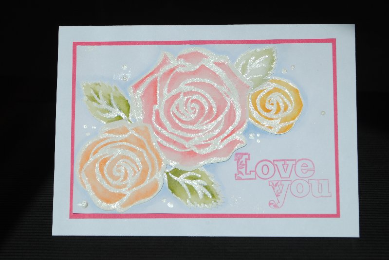
I white heat embossed the rose image, applied lines of Distress Ink and blended with a water brush. This was lots o' fun.

 
I think this might be my favourite :)
 
I am not too fussy on the way the sentiment looks so I might do this one over again.
 
 
This one needs a boost but not sure yet what I want to do.
I like the effect of sanding the purple cardstock.


Friday, January 20, 2012

Tone on Tone Trials

I tried another card technique from the CAS class. This time multiple die cuts were cut from coloured cardstock and placed on a card front of the same colour- tone on tone. Jennifer said in her video that she cut one die cut from the coloured cardstock but cut the remaining die cuts from white so that she did not waste her coloured paper, but I had lots of red as it was recently on sale at Michael's so I wasn't worried about using a lot of it.
With Valentine's Day fast approaching, I thought this was the perfect opportunity to make a few cards.
Here are 3 cards with slightly different approaches.
The card on the far left was made using multiple cuts of Je t'aime (from the Cricut cartridge Ashlyn's Alphabet) from red cardstock, then secured to a red piece of cardstock which was then adhered to a white card. I liked it but... The card on the far right was also cut from multiple layers of red cardstock but this time I covered the front of the die cuts with Ranger's Glossy Accents-nice and shiny. This gave it a little more pizazz. Because the die cuts were shiny I thought the card base should be as well so used a glossy piece of cardstock this time. Not too bad!

The most interesting and most effective card is the middle one. I went with card base and first layer cut from pearlized red card stock and cut the remaining layers from white cardstock as Jennifer suggested. Magnificent! The white cardstock is the way to go for under layers :) The Te Amo and butterfly are also cuts available on Ashlyn's Alphabet.

I will be using this technique again.

Sunday, January 15, 2012

Hello Friend from CAS Day 5

Thought I would give Jennifer's Wet Inking Technique a try. Here is the result.

I am unsure if I am going to add a banner sentiment or not... or just wait to see how the inside of the card develops.In this image it is hard to tell that the card has a pearlized finish. Below demonstrated this a little better.

Cheers!

Although this looks like a New Years card (because I used the New Years stamp from Studio G) I think I may be able to get away with using it for an anniversary card. What do you think?

Clean and Simple Card Class

I signed up for another one of Kristina, Jennifer and Julie's card classes called Clean and Simple Cards (CAS). I have not been able to participate as much as I would like because my school assignments are dominating my time. I did however, manage to escape to my scrapping room for a few hours last night. Here is what I came up with.

This is the inside of the card. I have recently changed my thinking about the inside of cards; I like to embellish them as well.


Merry & Bright

DH's Christmas card My hubby wanted new sunglasses for Christmas, although I knew what type he wanted I didn't feel comfortable picking them out for him so I created this card that contained a gift card. I used the Doodlecharms Cricut cartridge for the multiple sun images and freehanded the remaining pieces. I added some Spiced Marmalade Distress ink to soften the edges. The doodle dots and smile were drawn with an embossing pen from Sukura.The sentiment on the inside was stamped with Versamark and the heat embossed with silver. The part of the card holding the gift card could have been better but I was running out of time and I knew it would not bother hubby at all that the holder didn't match.